As my first solo project at Visual Boston, I made all major design decisions independently. Although the UX research phase was rather linear and limited, my tactical experience from working on the
O2X App helped me - particularly in developing variable designs for sections like Resources.
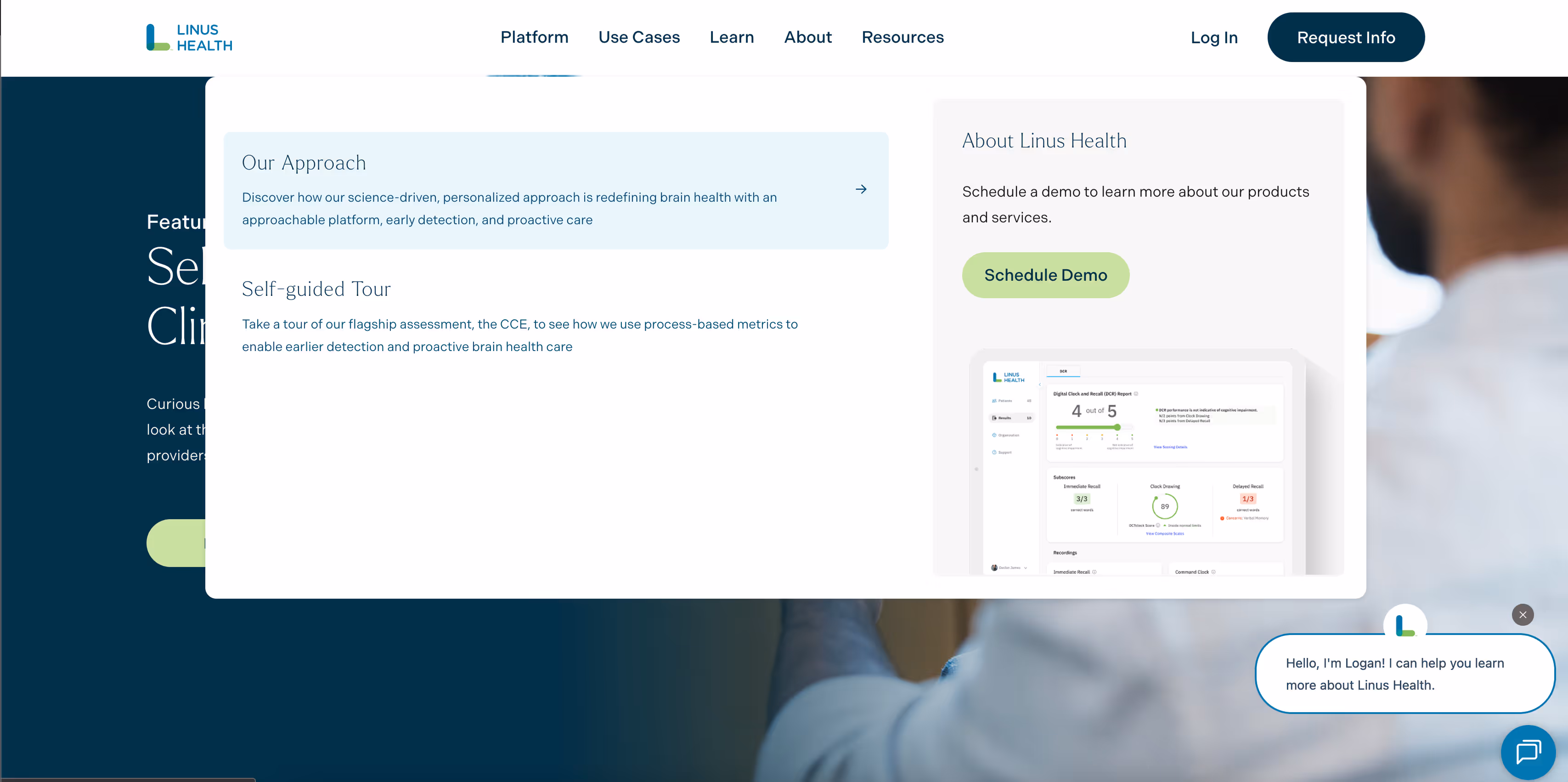
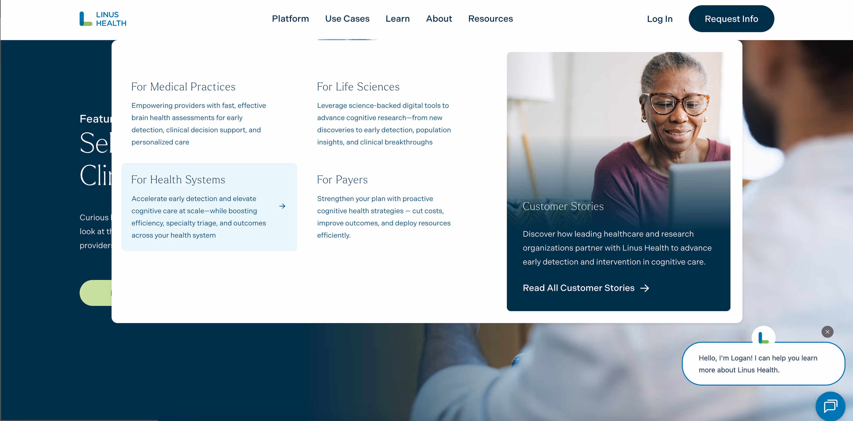
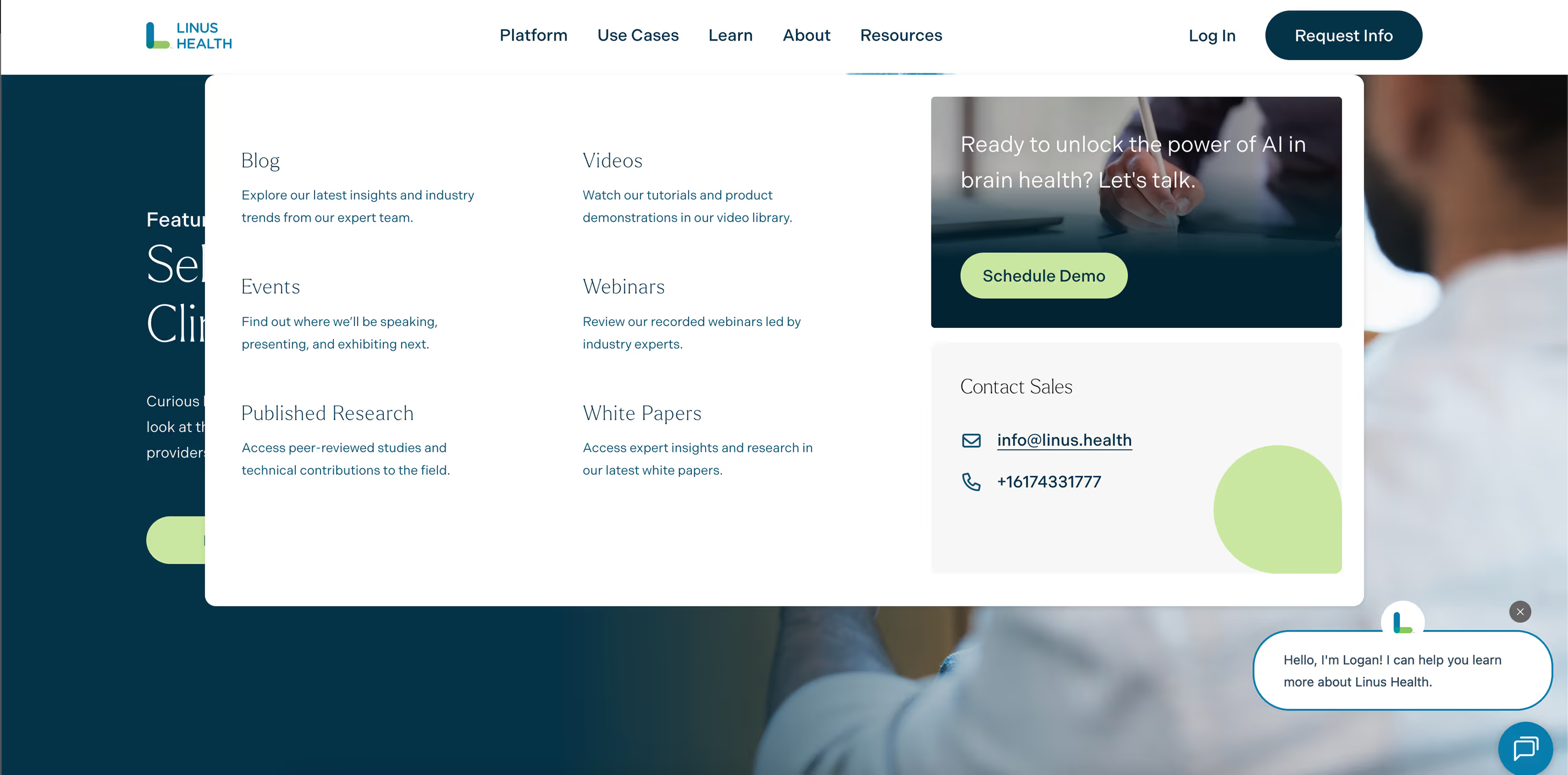
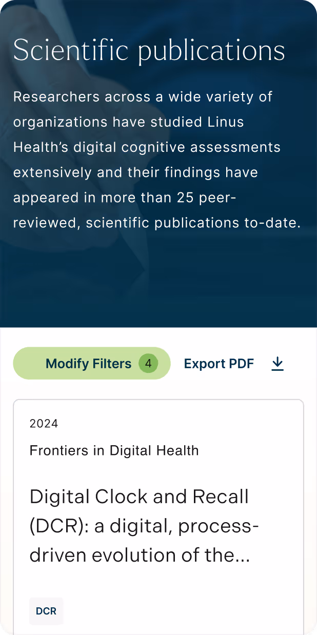
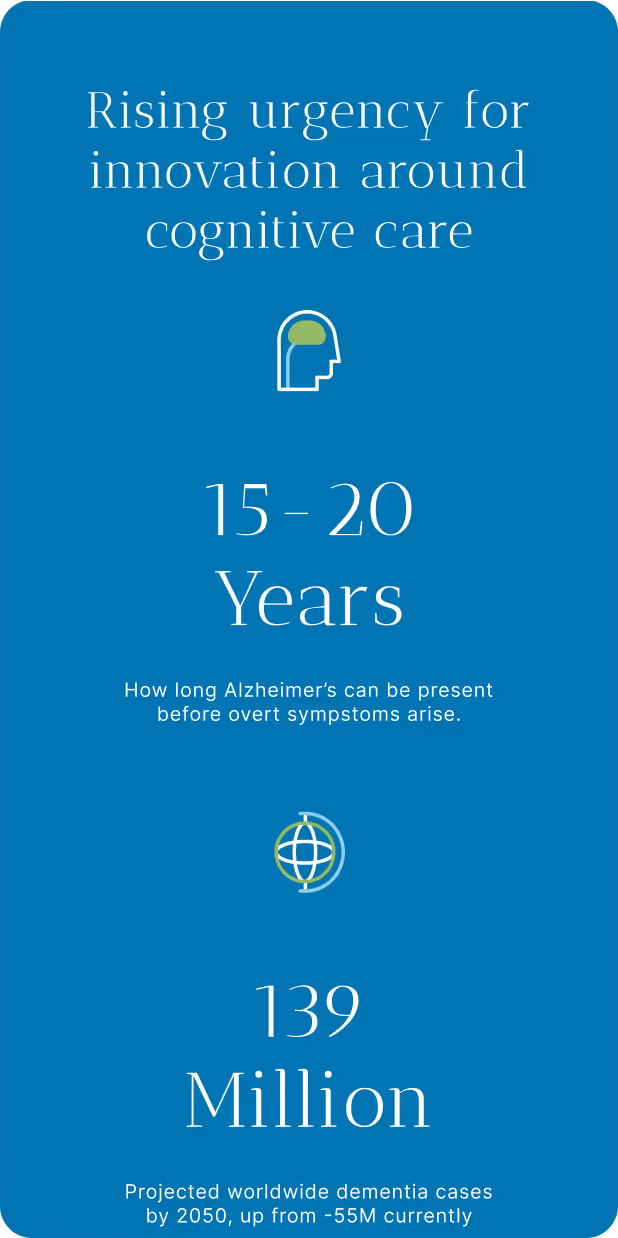
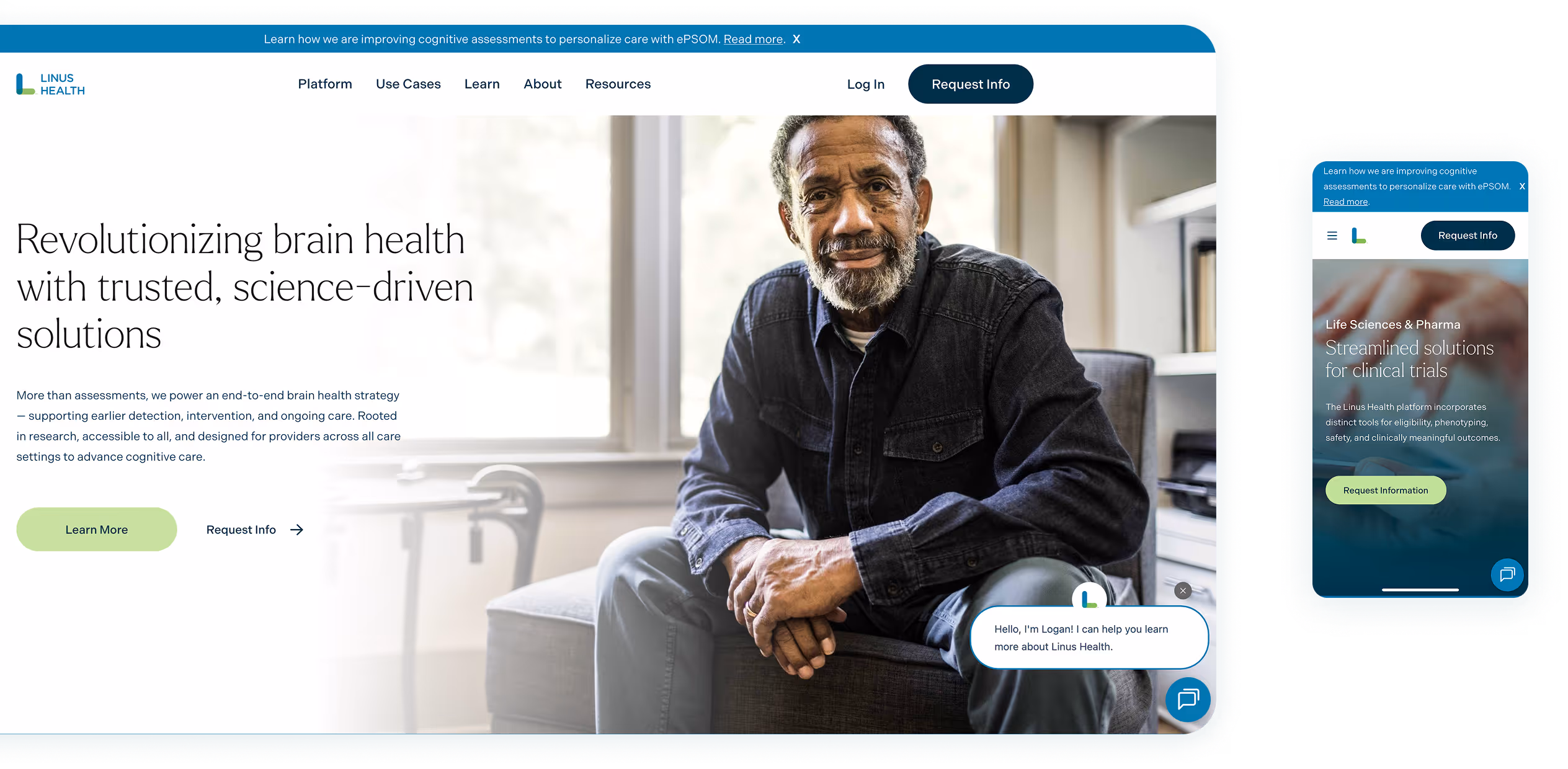
I conducted a mini-study testing this section on the existing portal, identifying pain points, and proposing navigation improvements for more effective access to scientific and press materials.
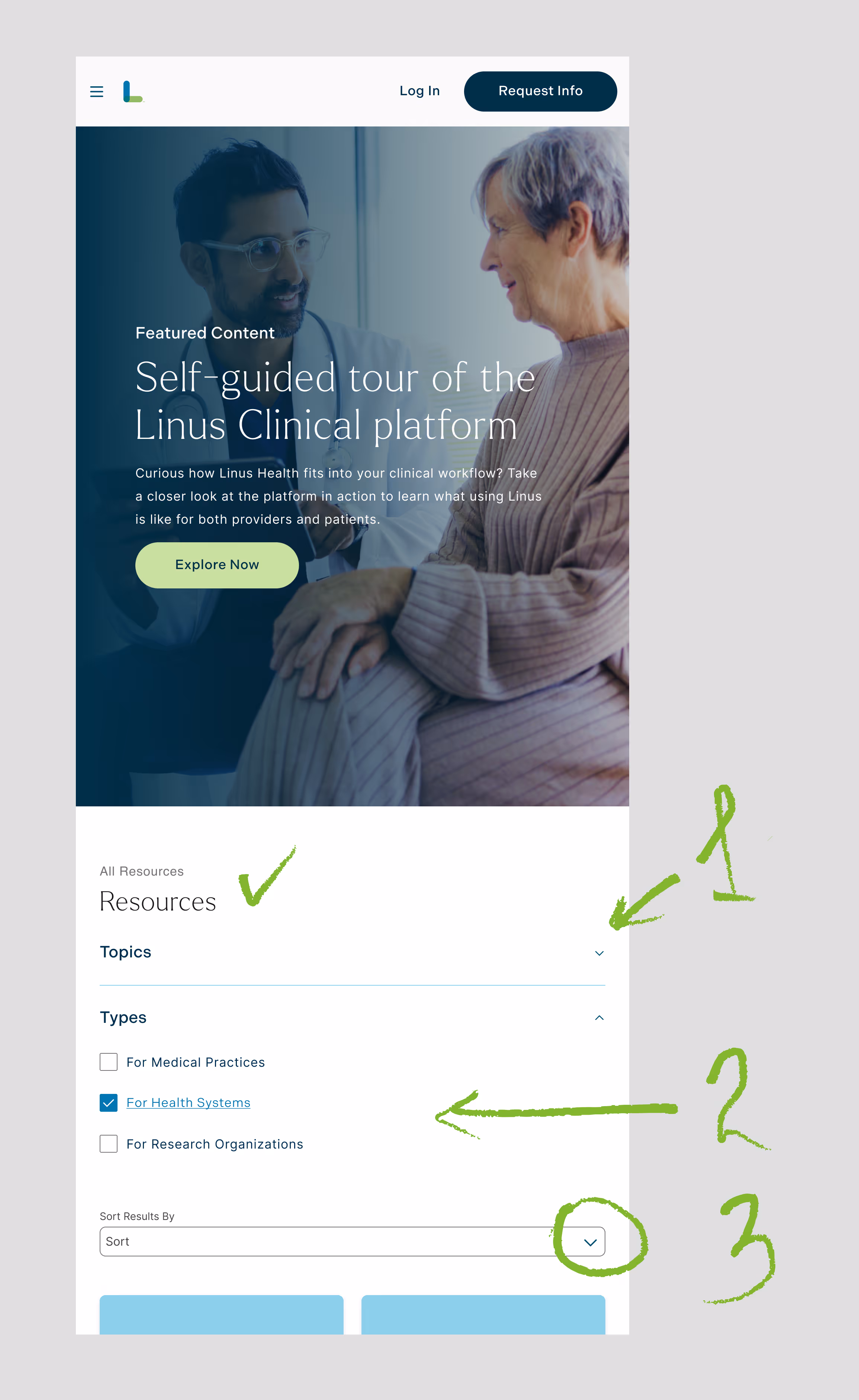
resources nav: (1) collapsing the sections by default since not everyone needs the searching tools right away; (2) the types are generally matching the types of the users visiting the section; (3) an important for the scientific materials tool
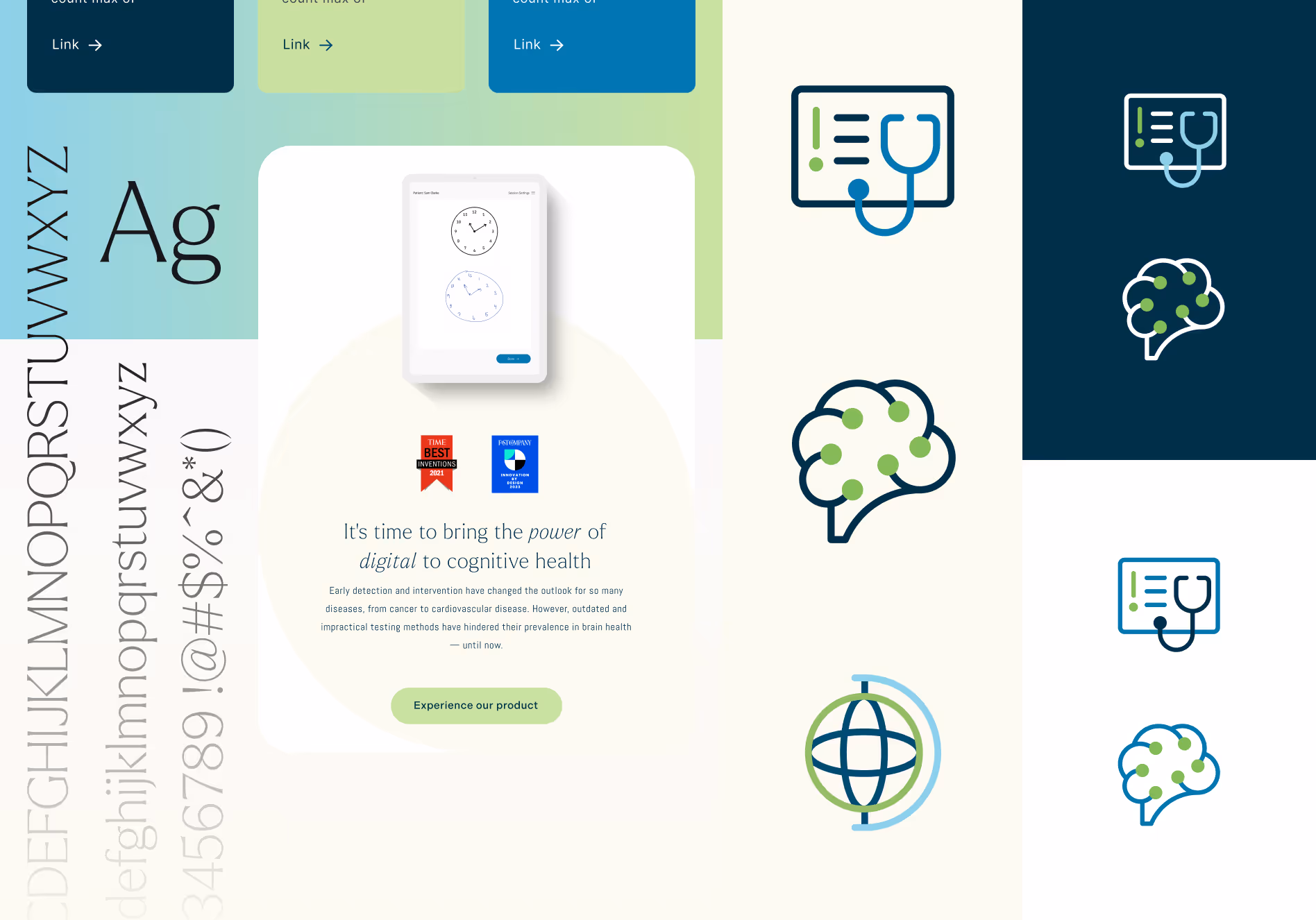
A crucial part of the process was developing the design system. I paid special attention to ensuring future instructions were clear, since one main goal was enabling the Linus Health
internal team to use components, change media content, and easily create new website sections independently when needed.
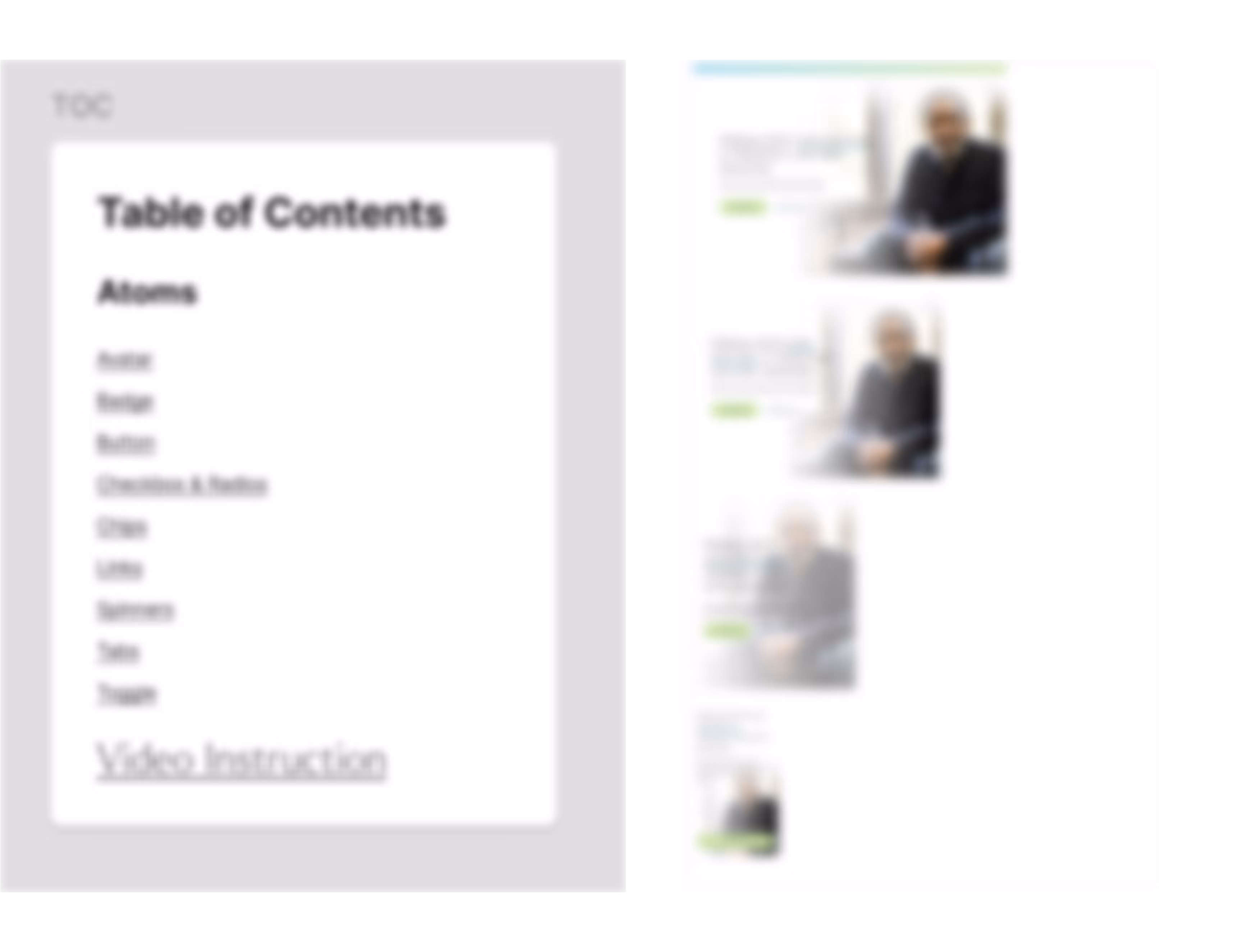
my atomic ds baby
This is where my years in non-formal education came in handy. Through annotated, ready-to-use components, a detailed Loom manual I recorded, and a live workshop with the Linus Health team, I created a working design system they still use today - empowering them to maintain and expand the site independently.
With Figma's constant updates, I regularly adapted component execution to maintain system integrity. Debugging and optimization became ongoing tasks that kept the design system functional and current.
A fun fact: not all Figma updates made it into the project.
When Figma introduced Booleans for components, we were initially excited it would eliminate component duplication.
But during implementation, engineers needed to see all component versions in real time to compare and visualize changes from breakpoint to breakpoint and state to state. So we still included all variations in the design system - prioritizing dev workflow over file efficiency.
Highly usable design heritage:
→ crearte clear instructions on further use
→ create high-quality and double check usability of the components and DS
→ hold workshops on components use
Raising clarity and responsiveness of the UIs:
→ use best practice for better responsiveness of the sections
→ double check of the prototype and QA at different break points

