This created consistent appearance across the website and reinforced brand identity throughout the company's digital presence, establishing visual standards for future development.
I advocated for high-contrast solutions across all elements, ensuring the project achieved at least AA-level readability throughout, significantly enhancing accessibility characteristics.
DS
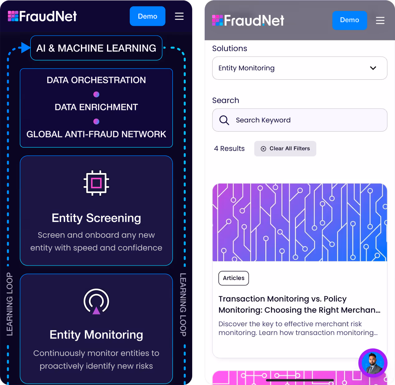
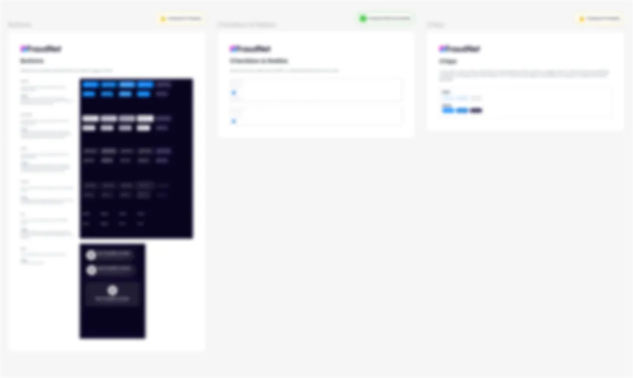
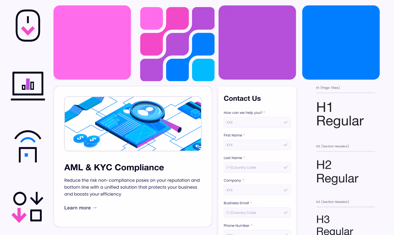
I co-led creation of a robust design system with variables, components, and responsive elements optimized for Webflow production. Collaborating closely with engineers, I ensured pixel-perfect implementation for every screen.
I conducted workshops with the dev team, streamlining workflow and reducing production revisions by ~40%.
Low brand presence:
→ using variables across the project
→ setting up the brand typography and color palette
→ search of available thematically-fitting illustration pack that can be used, in future, as well
Achieving consistency:
→ creating custom patterns for the CMS
→ using DS elements for the social media previews
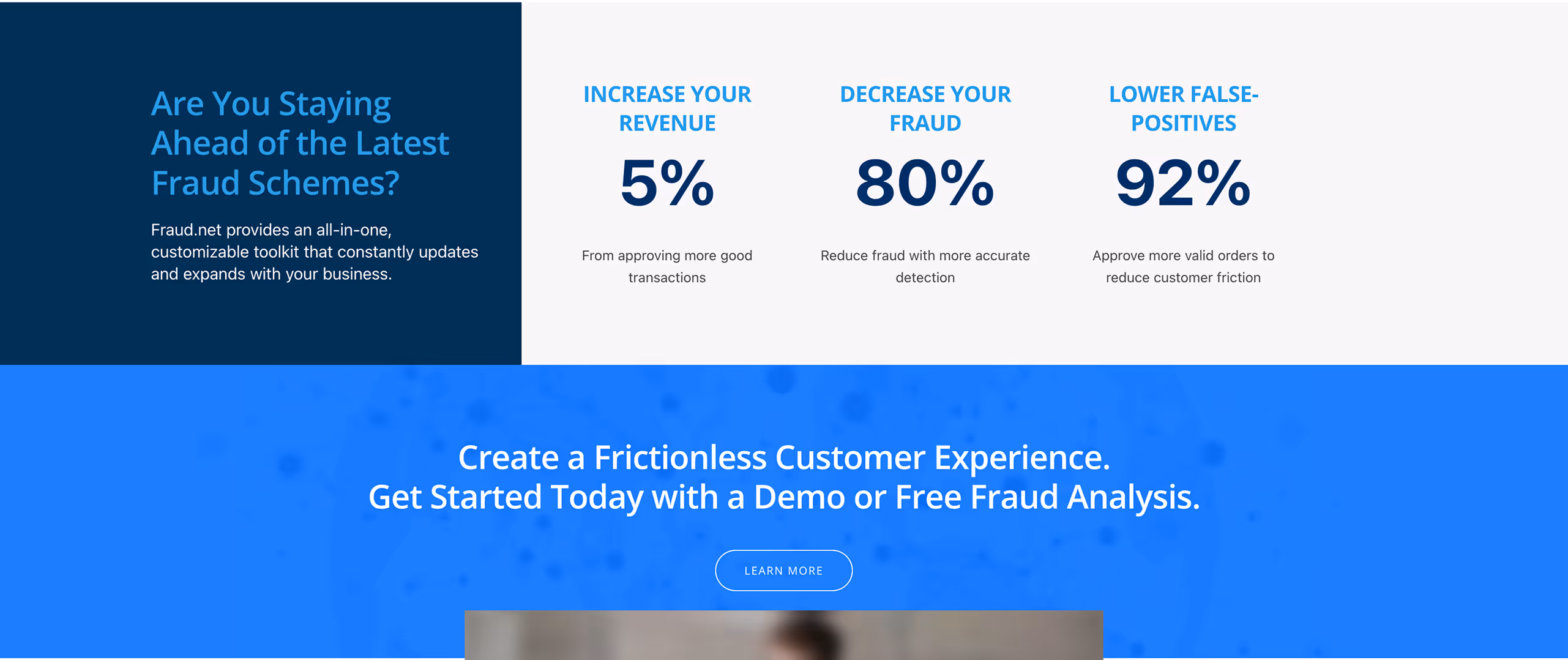
→ using consistent elements and effects for the infographics

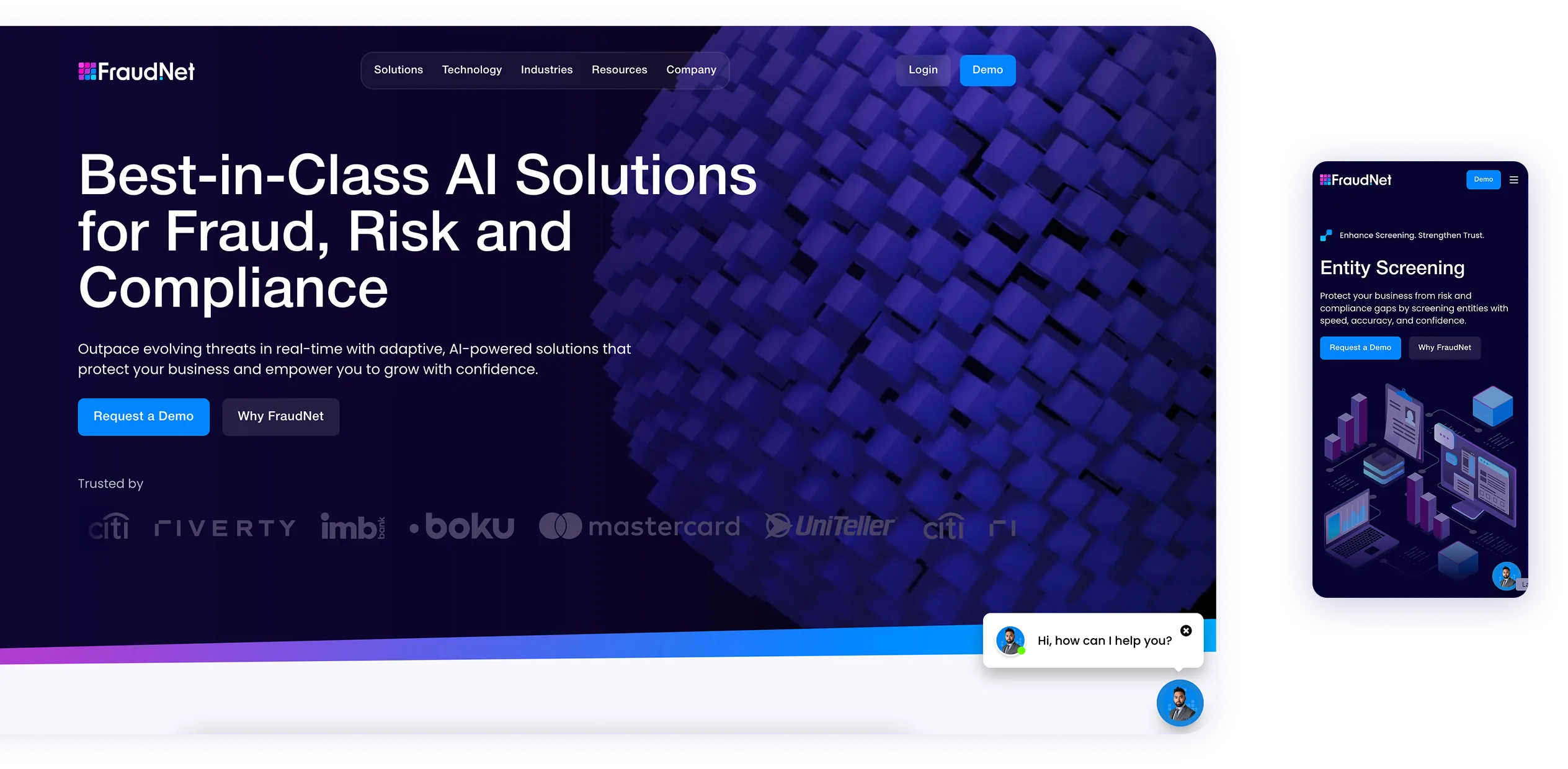
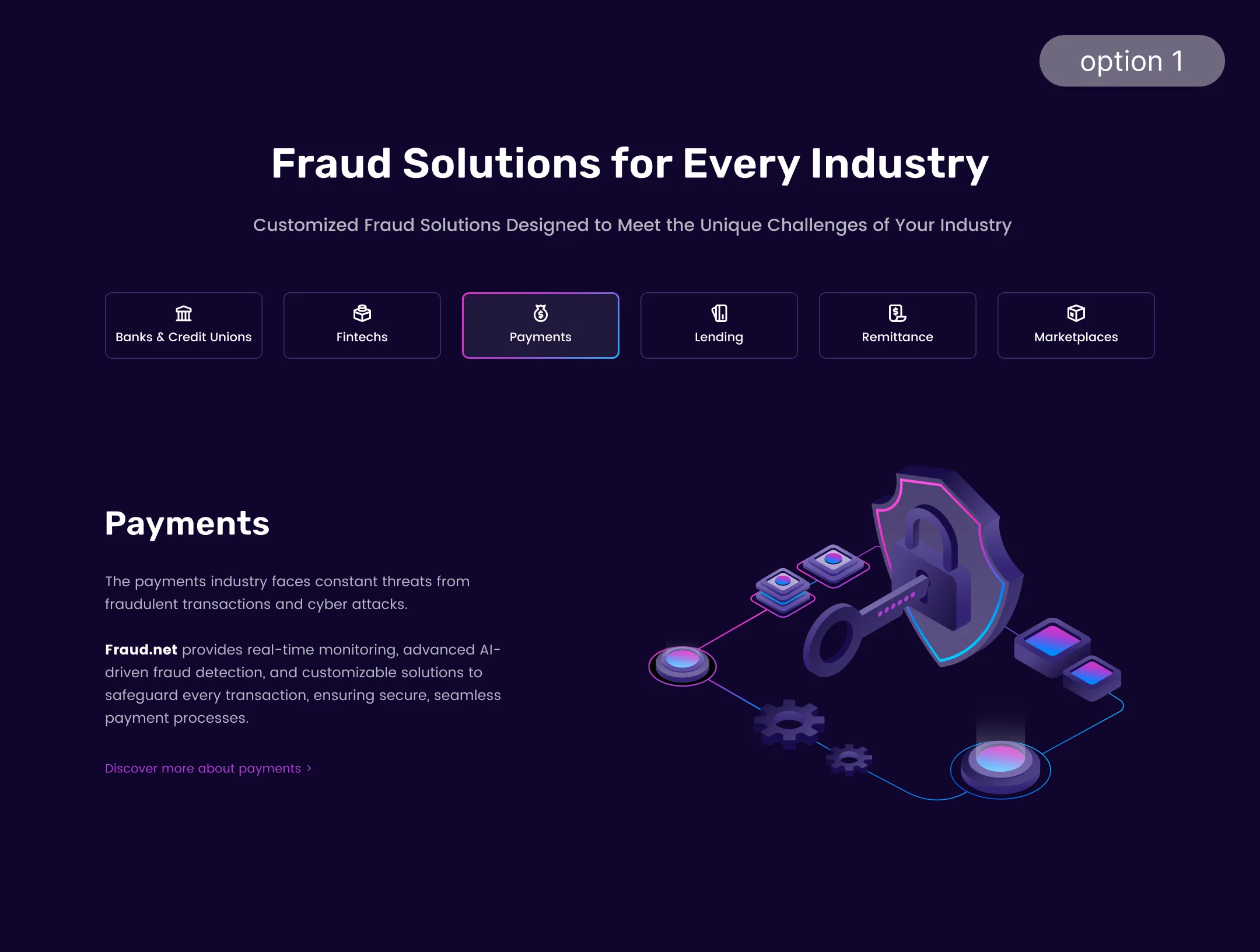
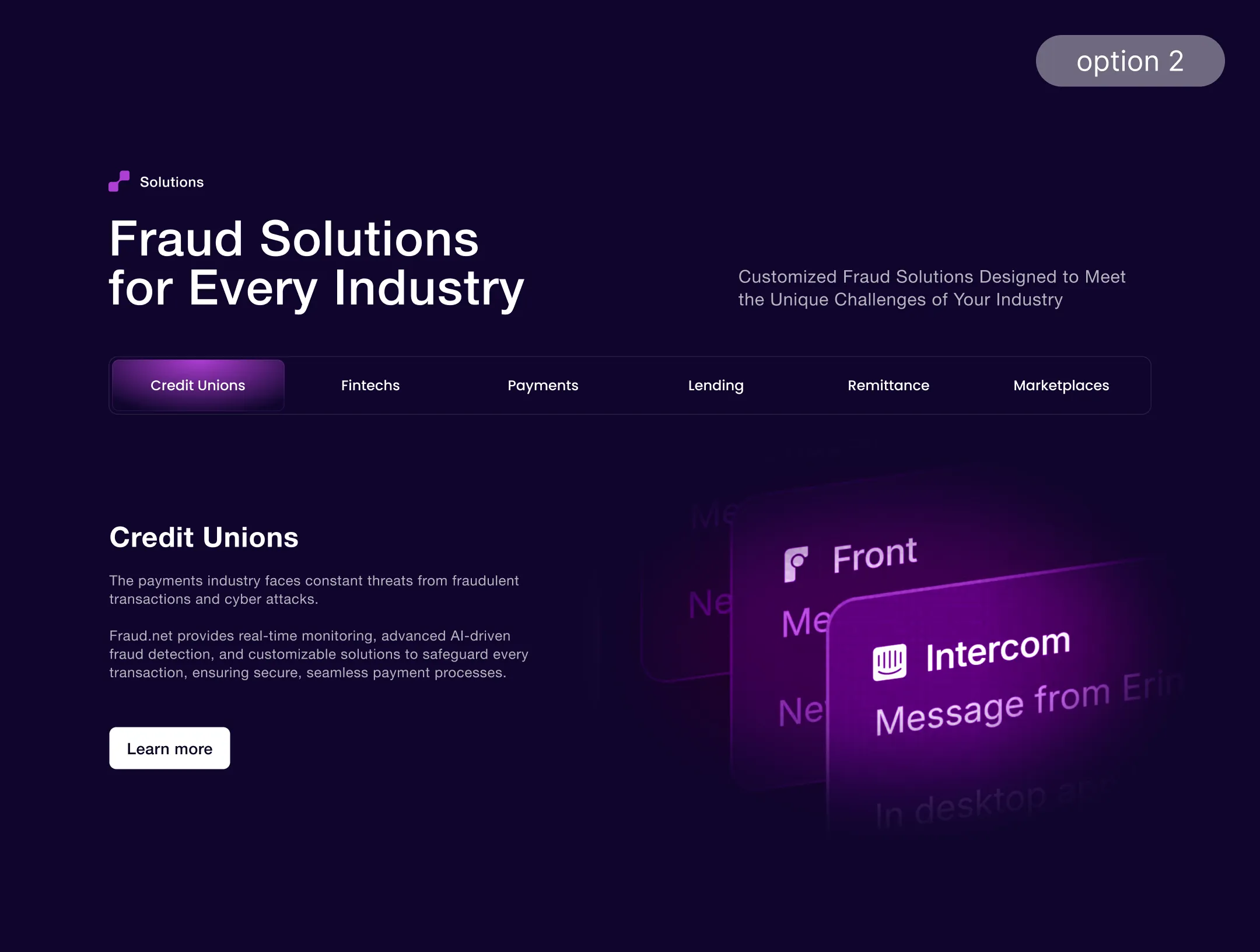
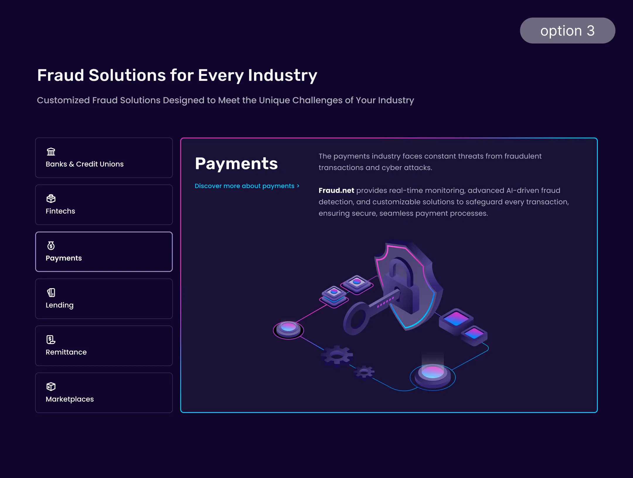
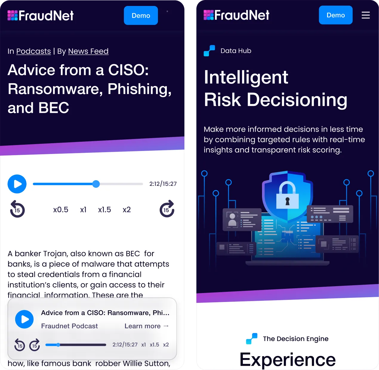
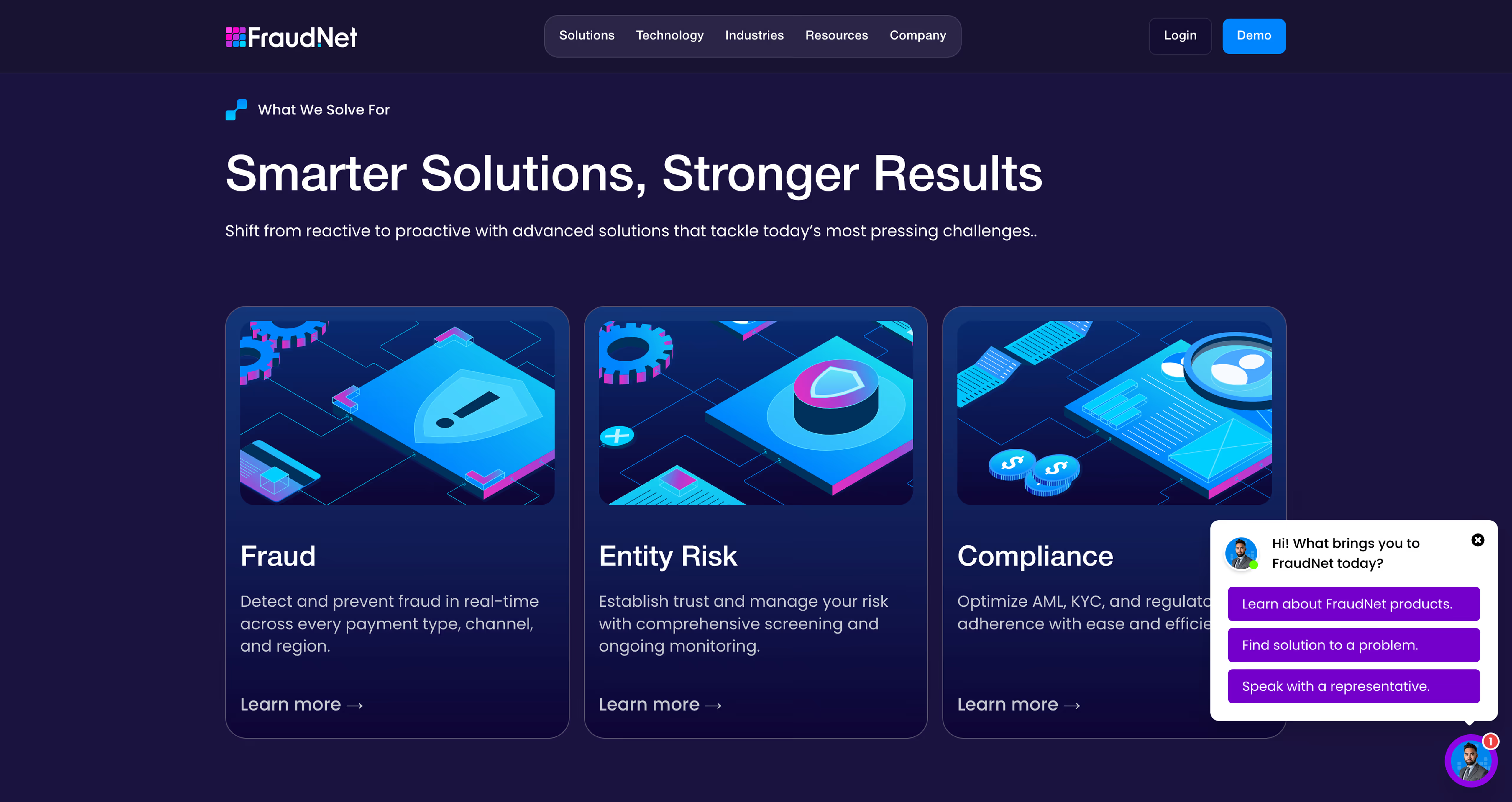
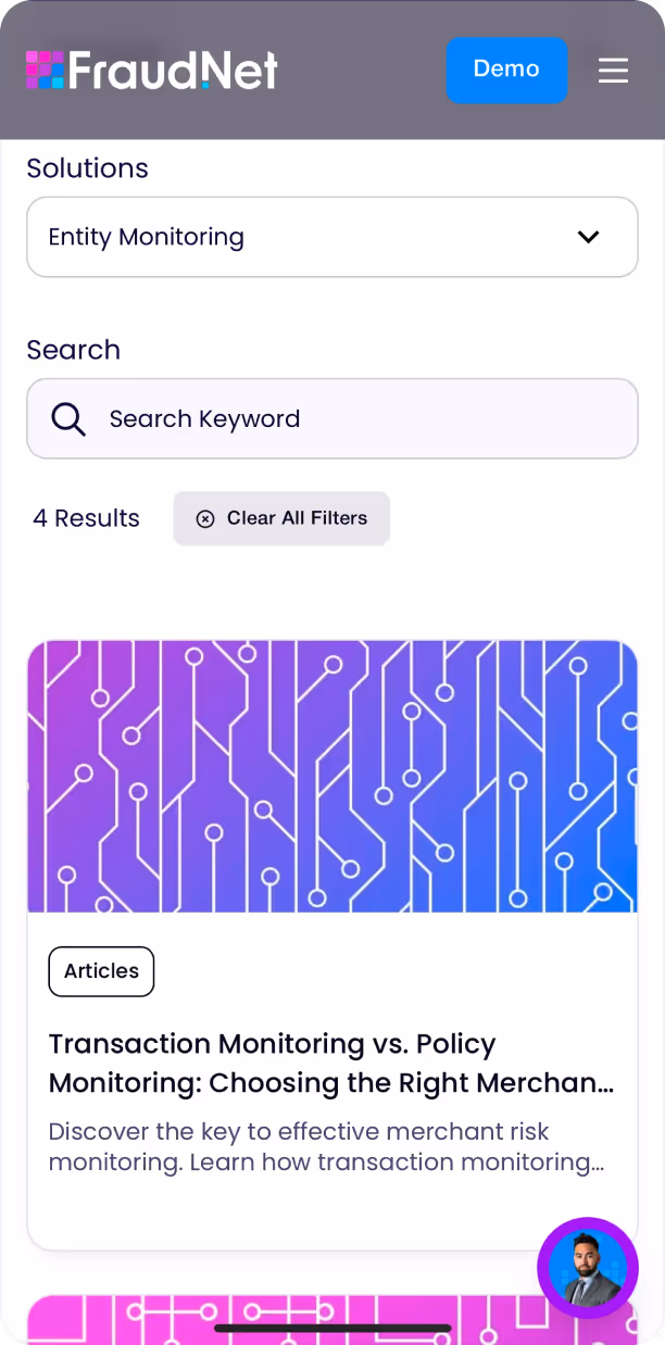
Fraud.net wasn't just a website - it was a complex B2B portal designed to educate prospects and convert enterprise clients. With CMS integration for 400+ articles, webinar functionality, and extensive custom features, the project demanded creative and strategic problem-solving.
The design process was highly iterative, requiring constant re-evaluation as content evolved dynamically. This complexity resulted in improved conversion funnels.
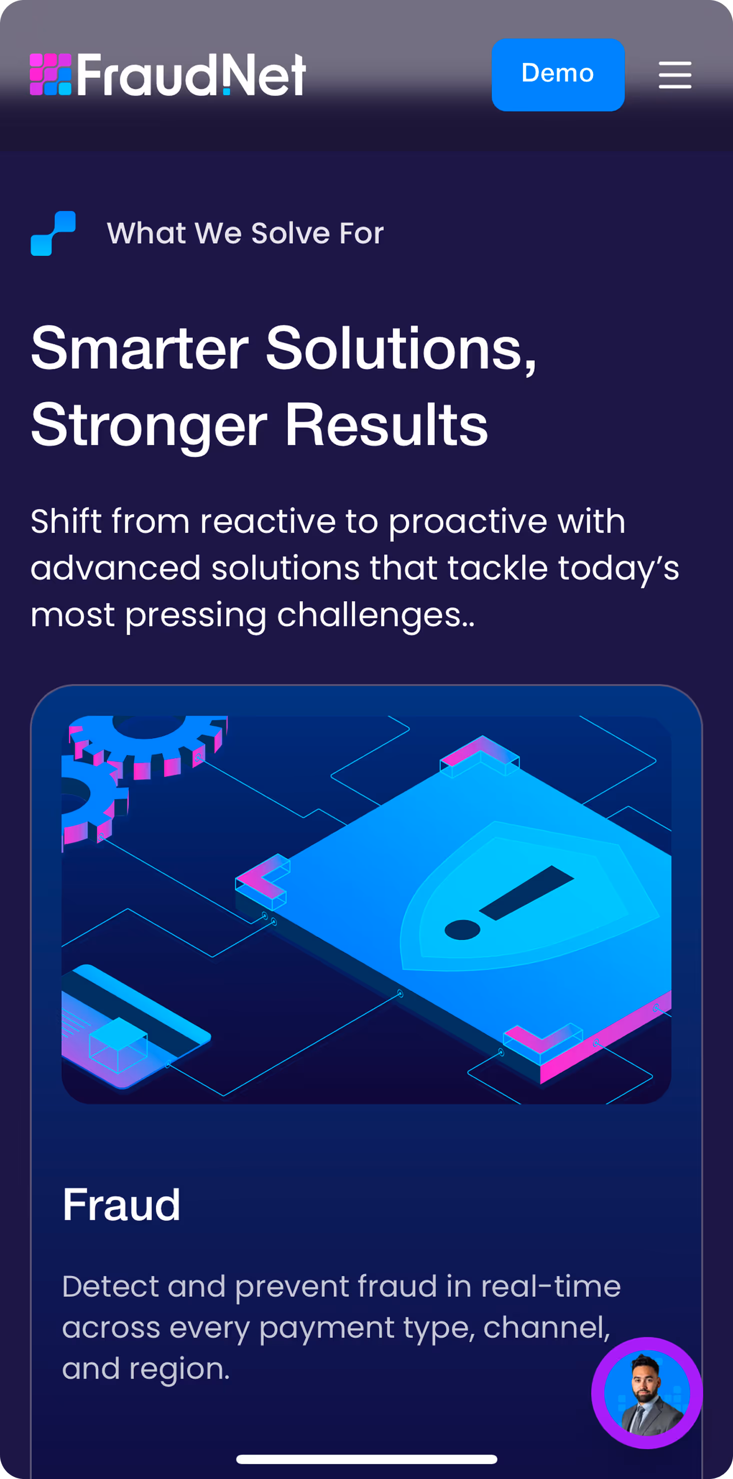
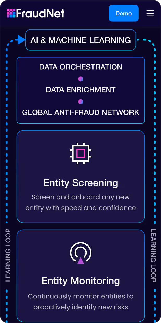
I contributed several creative concepts that became signature elements—including the interactive hero section and custom infographic system.
From there, the work was intensive: pitching concepts, collaborating with stakeholders, refining layouts, and advocating for user-centric design decisions that balanced aesthetics with conversion goals.