Bread Revolution Organization

website
sales/gastronomy
2023
about
BRO Bread was a bakery course website project aimed at increasing conversions and redefining the brand’s positioning for a more premium audience. As the lead designer, I worked closely with the marketing specialist to align business goals with design decisions, creating a refined, editorial-inspired layout that showcased the product’s artisanal quality and boosted its overall appeal.
my part
Lead Product Designer / UX Research / UI Design / Design System
gaining trust with the client through high-end visuals and relevance
challenges & how we solved them

Desiphering the business needs to perfect the design process

This small project was truly special — and here’s why. I was the lead and only designer on it, and I had the chance to work alongside my best friend and brilliant marketer, Liudmila Henderson. Our main goal was to increase conversions and, as a result, sales. Both Milla and I combined our years of experience working with business clients and our personal backgrounds in sales to build a clear strategy for how we could help.
First and foremost, it was crucial to establish precise brand positioning — to make it immediately clear what the product was, who it was for, and what made it unique and valuable. As the lead designer, I took on both UX research and UI design,
while also advising the stakeholder on how visual style directly affects conversion rates, and why the right look of the main sales tool can not only improve immediate results but also build long-term trust and perceived product value.
An important aspect was that the client was in the process of product conversion and brand repositioning, aiming to reach a broader audience within a higher price segment. Mila and I managed to convince him that a well-crafted visual identity — paired with smart SEO — could help him achieve this goal. I then conducted a full research process on the business, target audience, and desired visual direction.
The main creative idea was to present the baking courses as a high-end, exclusive experience, using a layout inspired by editorial design seen in magazines and luxury brands. That’s where the idea was born — a minimalist monochrome frame that made the high-quality imagery pop, capturing attention and working as one of the core user hooks.
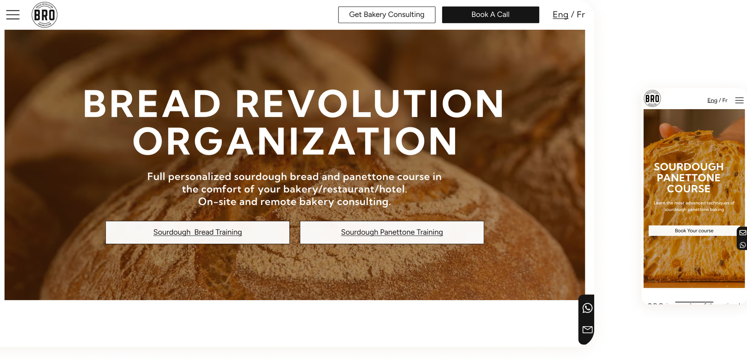
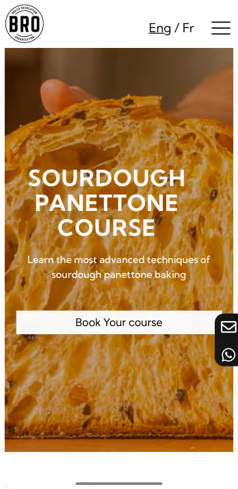
mobile menu
Tailoring design process:

→  deep understqanding of the business nature and needs
→  brainstorm sessions with the marketer
→  consulting on the possible scenarios of how design can contribute to achieving the business goals
Solo UX research:

→  gathering and exploring available metrics of the existing product
→  research on the existing and future demography
→  learning best practiceof the direct and indirect competitors

Recreating and redefining the brand appearance to make it global

The main creative idea was to present the baking courses as a high-end, exclusive experience, using a layout inspired by editorial design seen in magazines and luxury brands. That´s when I came out with a minimalist monochrome frame that made the high-quality imagery pop, capturing attention and working as one of the core user hooks.
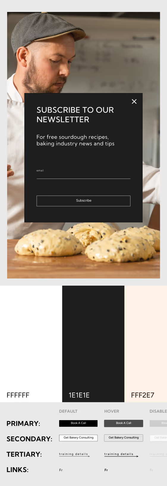
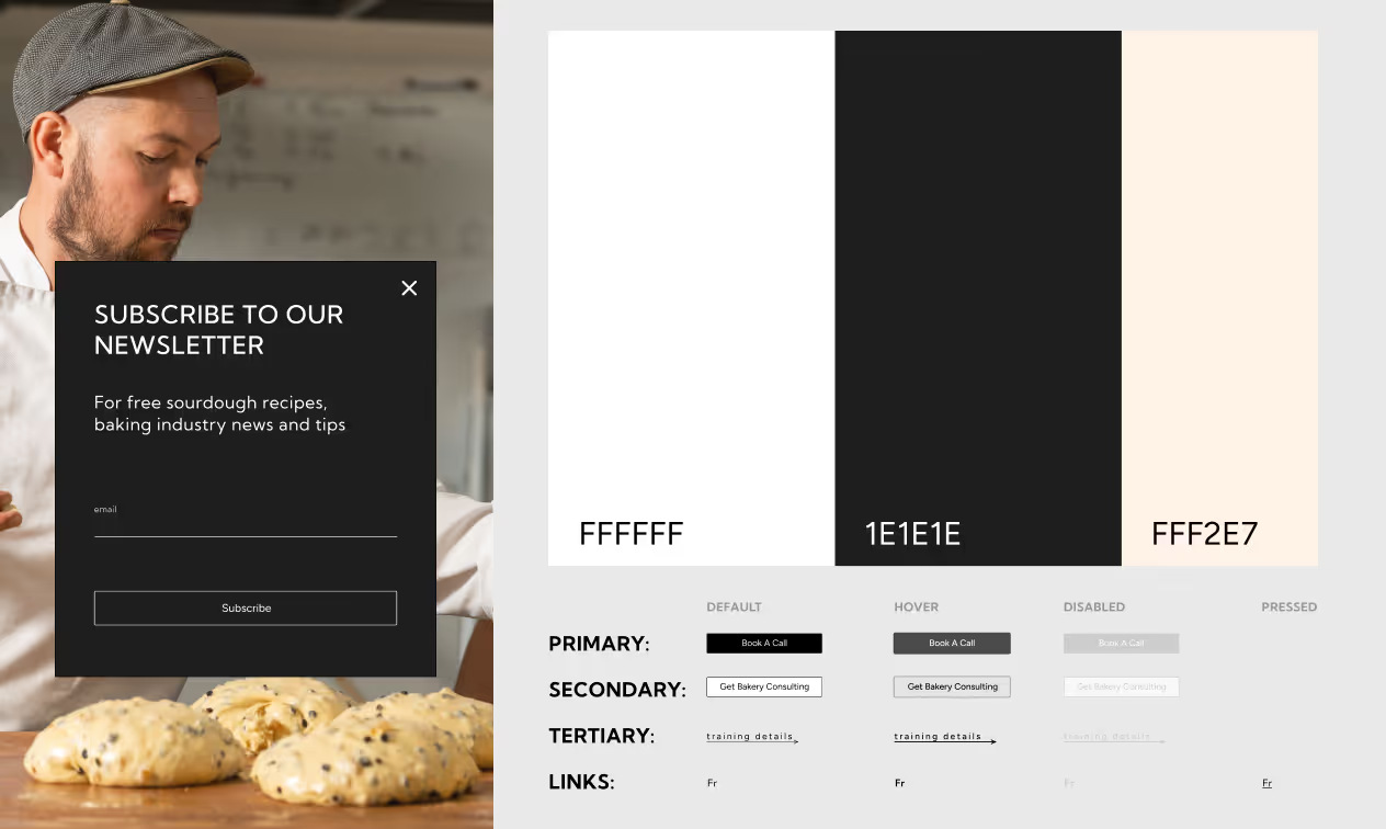
newsloetter custon popup and articles preview
When we started working — Milla on the content and me on the visuals — we encountered our first challenge. In most cases, design is a flexible structure where text length can vary, but in this project, the exact word count and use of key search terms were crucial for achieving
business goals and SEO performance. Through testing, we realized that to make the text compact, functional, and engaging rather than overwhelming, the design and marketing processes had to work hand in hand.
As a result, we cut down large portions of text, added new sections, and rethought how to present the product’s benefits — making the narrative more visual and concise. This close collaboration with a marketing specialist not only taught me a lot but also allowed me to directly influence the client’s brand identity.
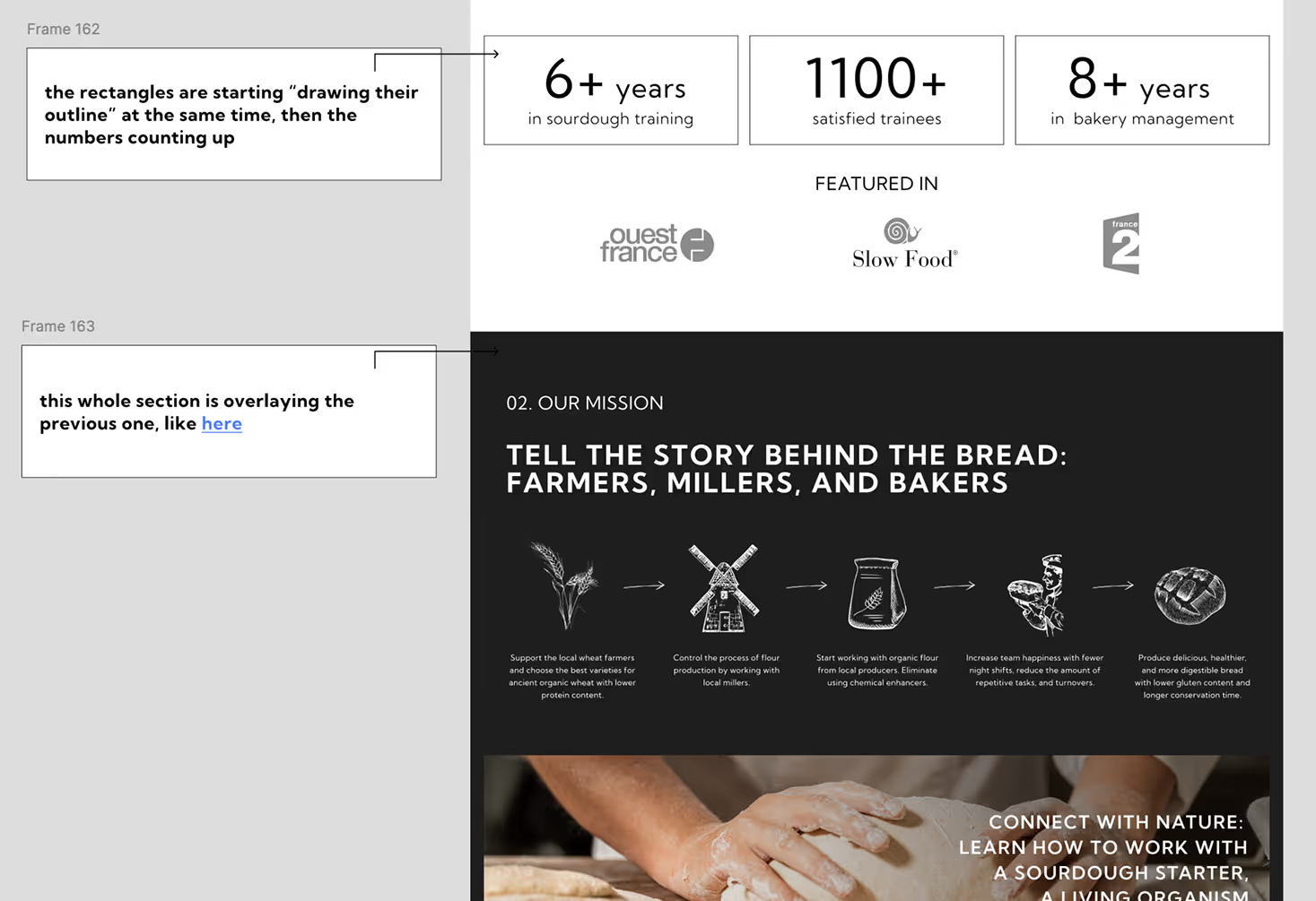
some annotations on the animation for devs
For example, we insisted that the client provide high-quality photos and videos, and also collect authentic testimonials from previous students, including real photos of their baking results.
I consider it a real success that we managed to compile a solid visual bank of the client’s products, as the main highlight of the course was an ancient dough fermentation method and the baking of classic French bread and pastries.
Updating the imagery allowed us to clearly showcase how competitive — and mouthwatering — the final product truly was. Personally, I love baking (and eating bread), so I was genuinely thrilled to curate the best images of panettone and loaves, even though it constantly made me crave pastries while working.
Maximizing design-marketing effort:

→  matching expectations of the results
→  live work to achieve the best match of the visuals and content
Long-term game:

→ creating timeless patterns for the product appearance
→  developing a kit of visual materials for the extended use
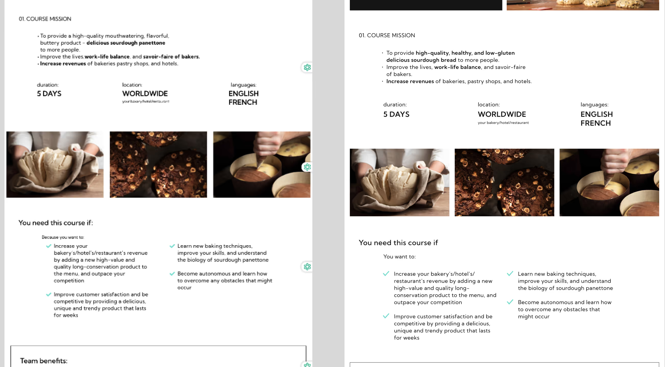
moments from the revisions of the dev work
results
Overall, this project became a deep collaboration between the design and marketing sides of digital product creation. I believe we achieved our goals — building a clear sales funnel structure, improving conversions, and increasing global search visibility.
6k+
visitors/month
9
specialists in
the team
100+
screens
designed
50+
custom elements
and patterns
Although the client later decided to conserve resources and the live version of the site didn’t fully reflect my original design (its structure has since been partially changed), I’m still proud that through this project I refined my skills in framing business goals, product positioning, and design strategy, while working on a topic that I truly love and that touches my heart.

Additionally, I created a complete visual kit that the client could use for social media content and branded materials, ensuring the website remained a cohesive, connected part of the brand identity.